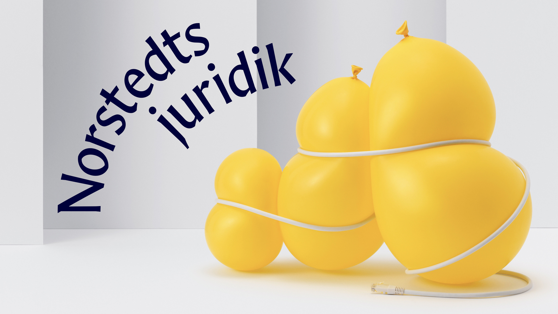
Karnov Display
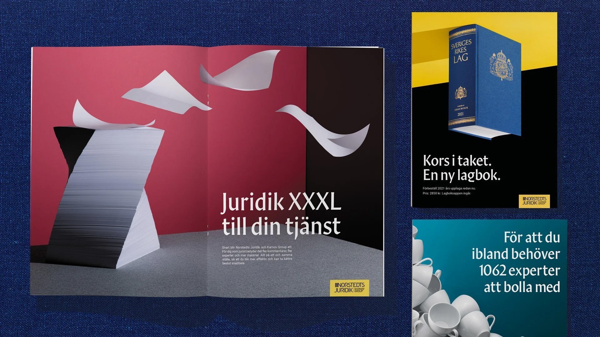
Custom typeface for Karnov Group, a Danish company with several sub-brands providing solutions for legal, tax, and accounting professionals. The typeface is part of a visual identity designed by Familjen.
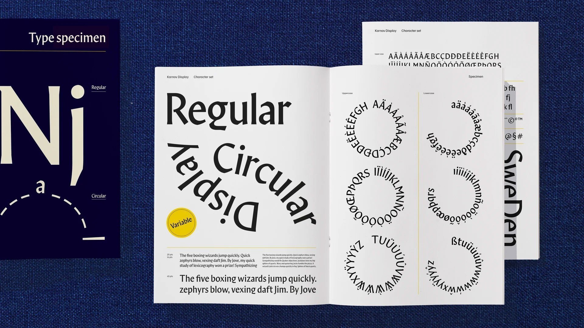
One specifically Danish feature is the lowercase g with its cut-off descender. It saves space, allowing the lines to be set tightly, while at the same time adding character. This kind of g is not unique to Denmark, but for some reason it’s become especially common there.
Beside the Regular style, I designed a variable font for setting text on circular paths. While you can set type on a path in software like Adobe Illustrator, that merely rotates the letters. At first glance it looks okay, but if you really care about typography you want optical adjustments, which you can get with the Circular variant of Karnov Display.
