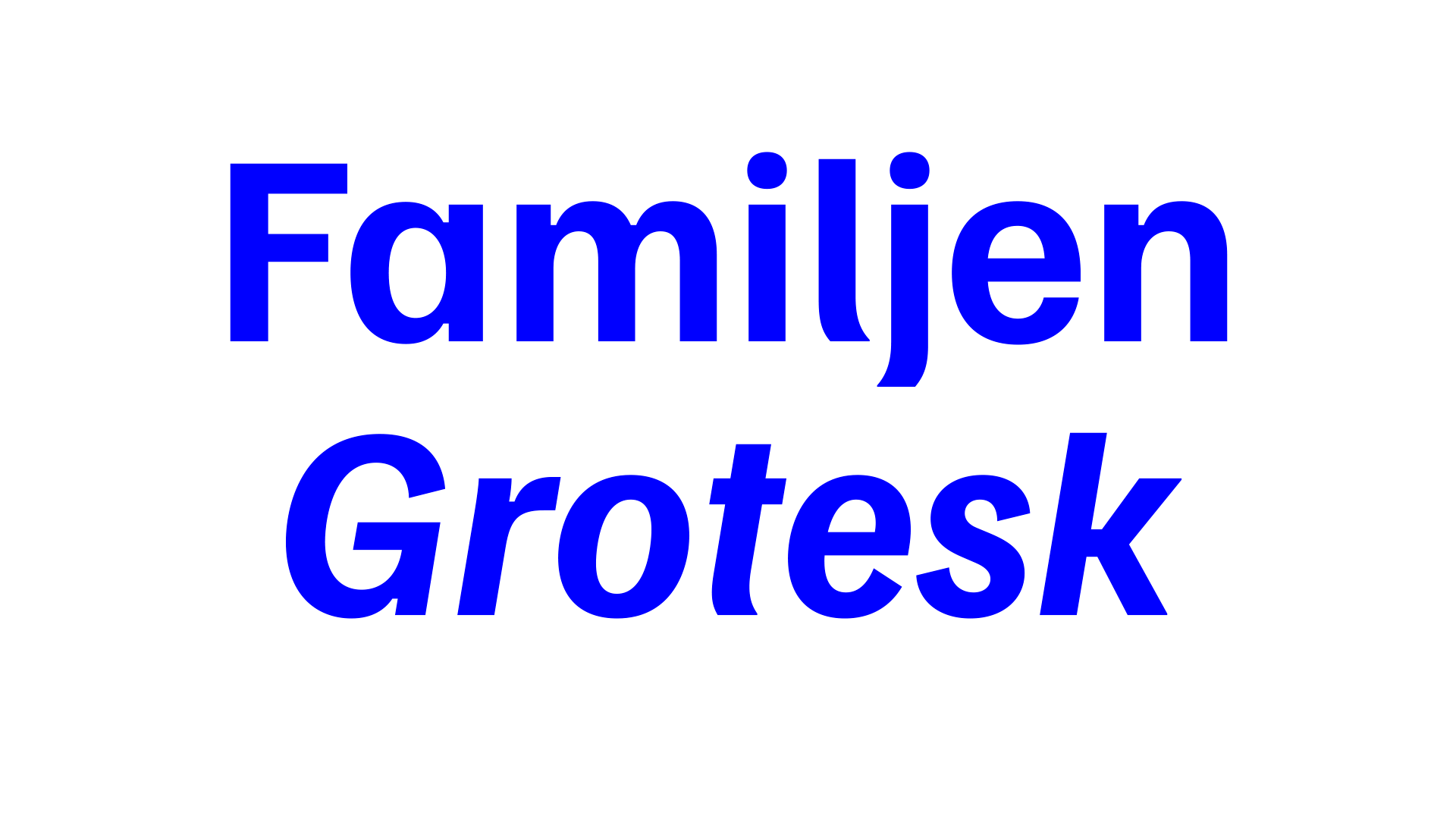
Familjen Grotesk
I originally designed Familjen Grotesk in 2019 for the agency Familjen, where I was working at the time, under direction from Jonas Bäckman and Matilda Gysing.
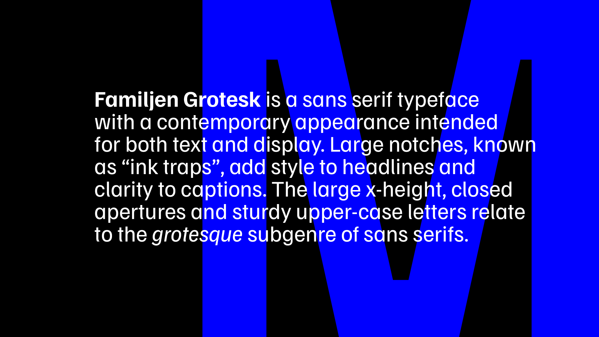
After some quick experimentation, we found a few ways to give it the contemporary feel they were looking for:
- Low stroke contrast (that is, little difference between thick and thin strokes)
- Compact vertical proportions
- Closed apertures
- Dynamic contrast between wide and narrow letters
- Very large ‘ink traps’ (the wide notches in the lettershapes)
- Some unusual characters, such as the lower-case ‘t’ and ‘j’, which merely bend a little at the bottom, without going horizontal or turning back upwards
- A single-story ‘a’
I also added an alternate two-story ‘a’, a three-story ‘g’ and eventually, as a joke, a four-story ‘g’.
Örjan Nordling and Kristian Möller contributed as well, the latter of which revised and extended the typeface for release on Google Fonts.
You can get Familjen Grotesk at Google Fonts for free.
If you’re interested in contributing, source files (that is, Glyphs files) are available at GitHub.
