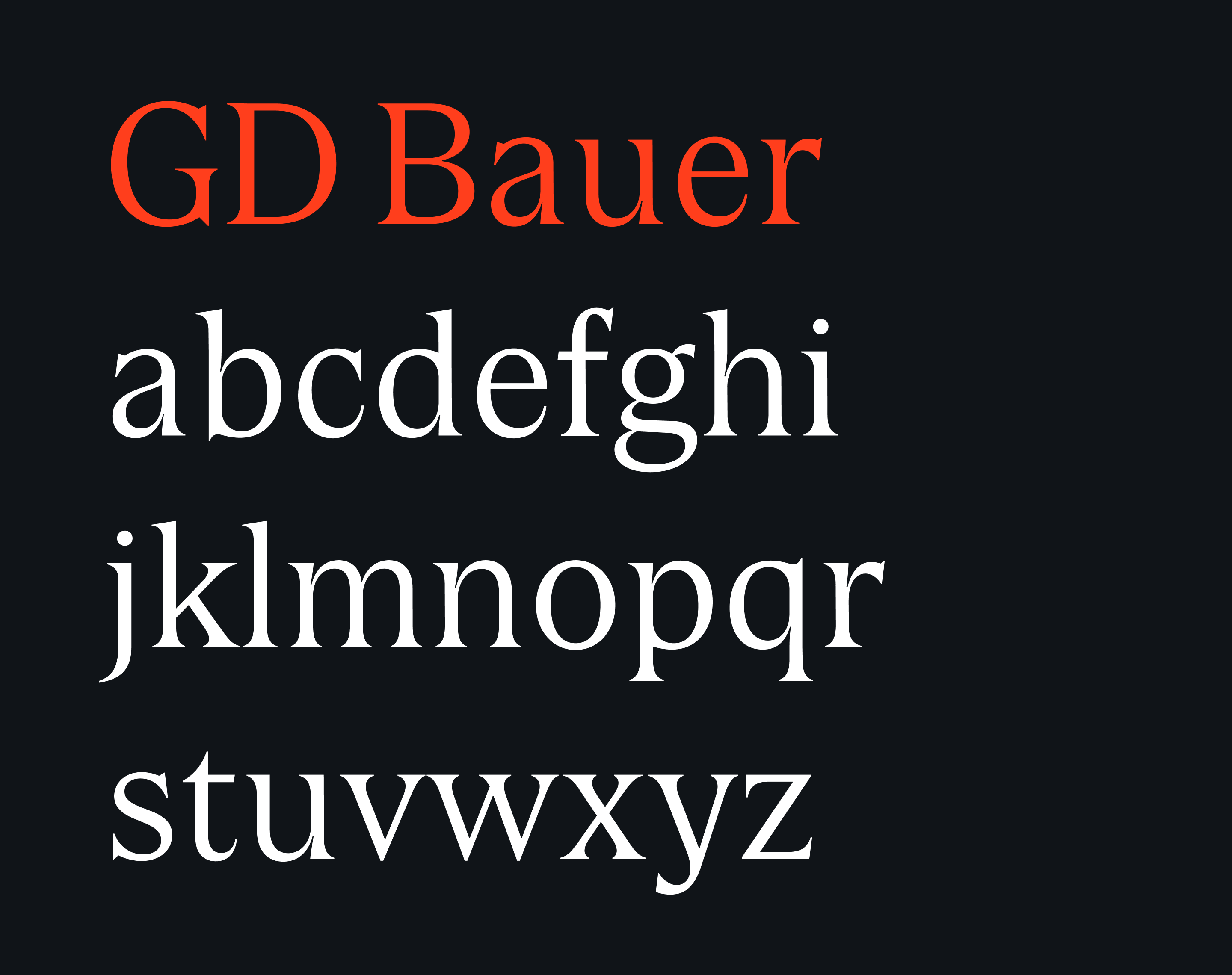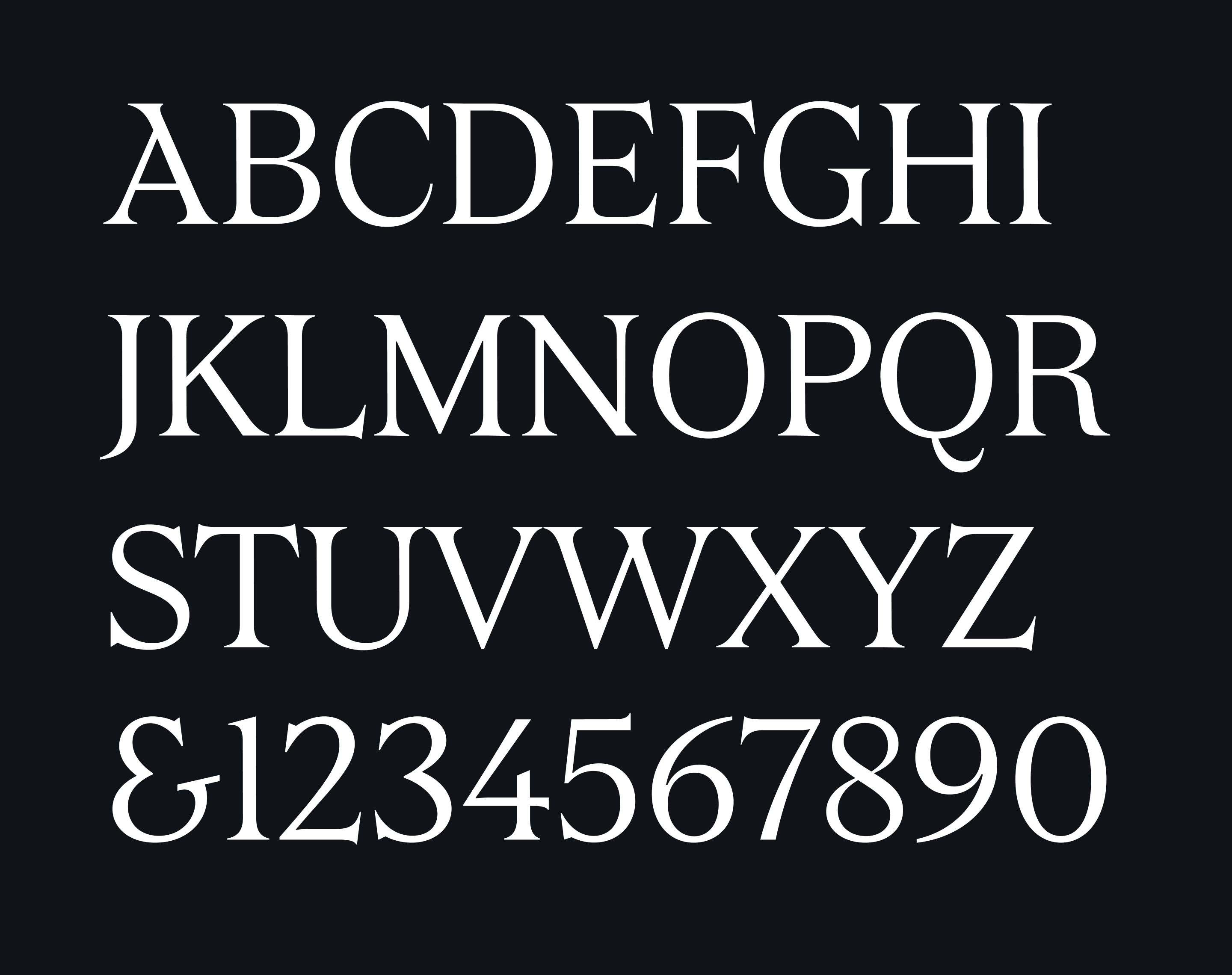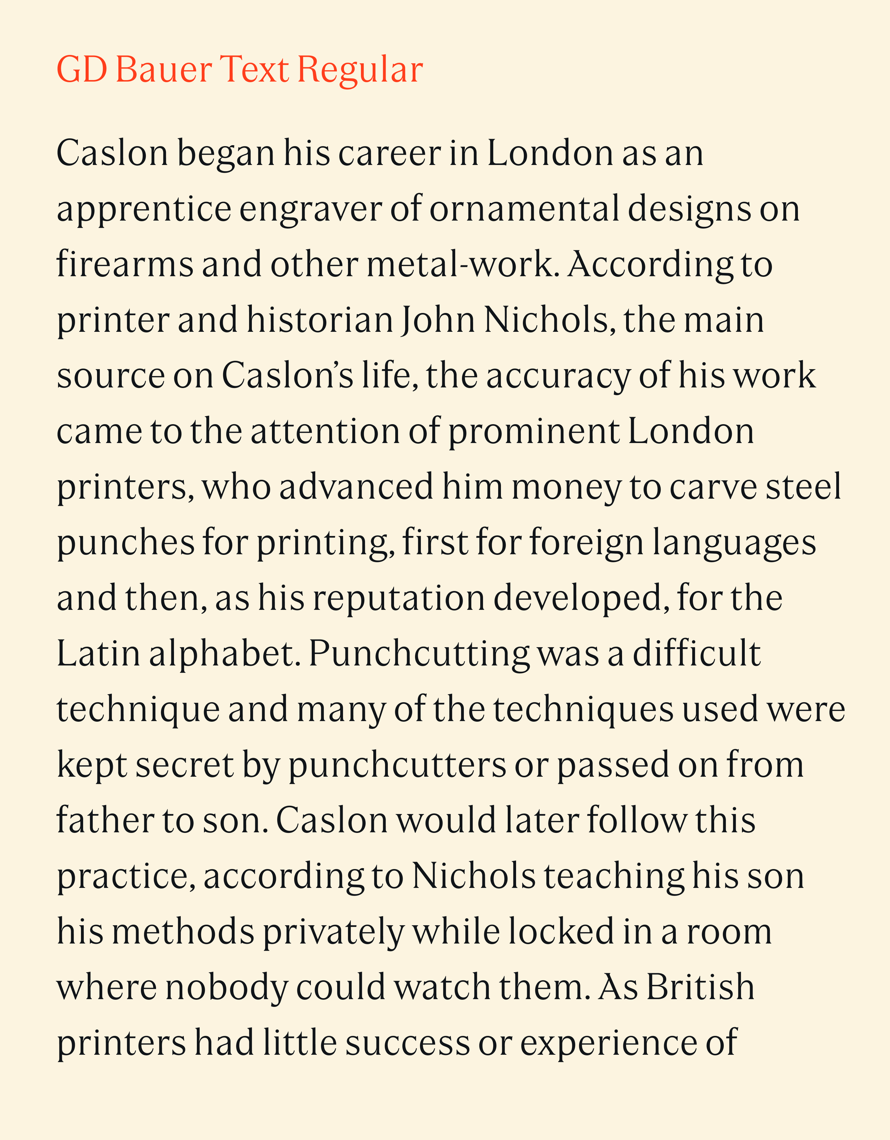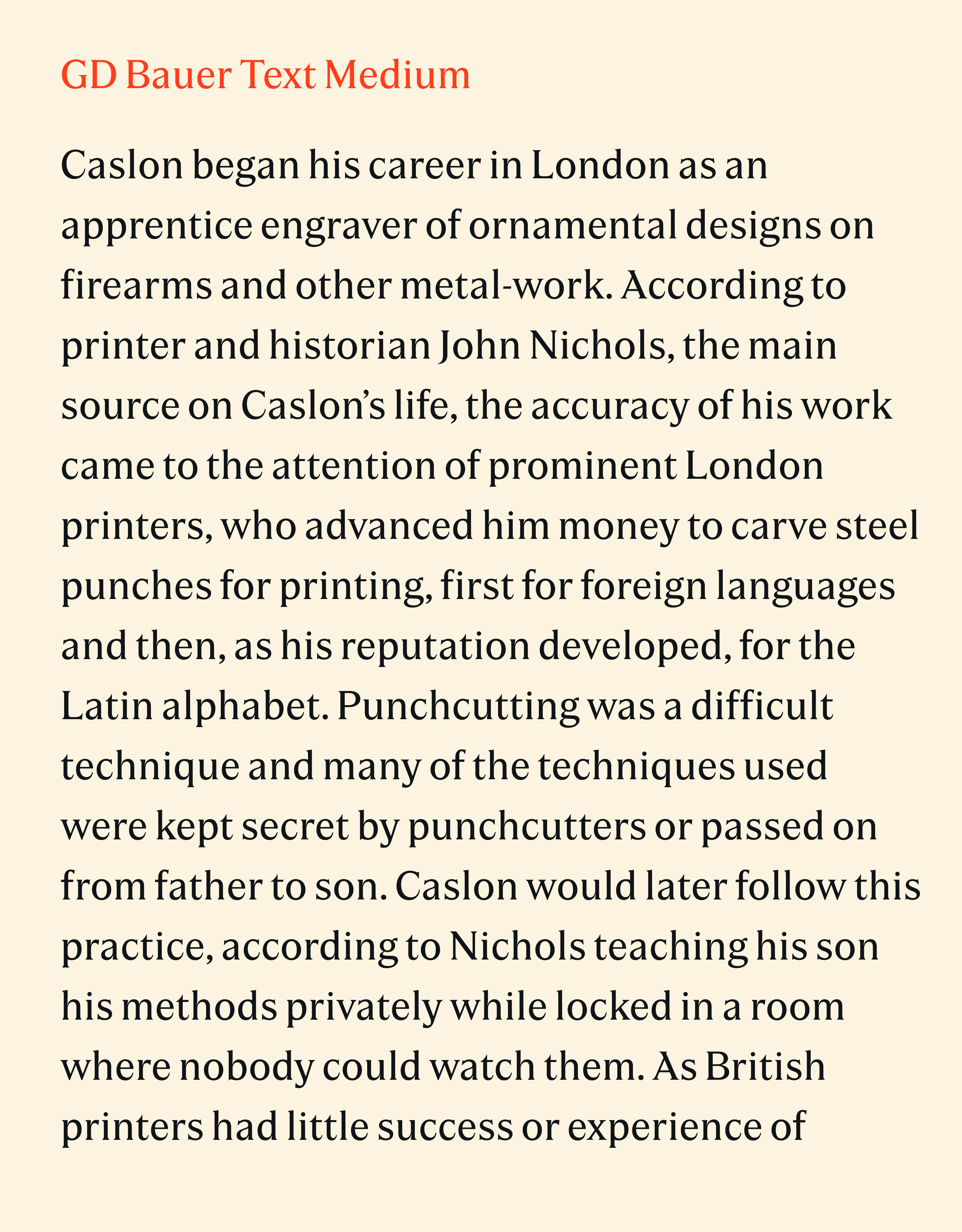


GD Bauer
19th century fonts are often dismissed or overlooked when the history of typography is told. But it was a time of exploration and innovation, when new genres like sans serif and slab serif emerged.
Another new direction explored during that era was the combination of pointy serifs with otherwise moderate contrast between thick and thin strokes. Unlike the generally high contrast of didones like Bodoni, this avoids the “picket fence effect” where vertical strokes dominate the texture of the type, while still creating a sense of sharpness and drama.
Co-designing GD Bauer with Paola Alonso Chapel and Marcus Gärde, I particularly enjoyed working on the Light weight, where the contrast between the assertive serifs and the otherwise delicate letterforms becomes the most prominent. It’s also the weight where the uppercase A, with its right stroke overhanging the left stroke, becomes the most striking.
GD Bauer is available from GD Foundry: