Quasimono
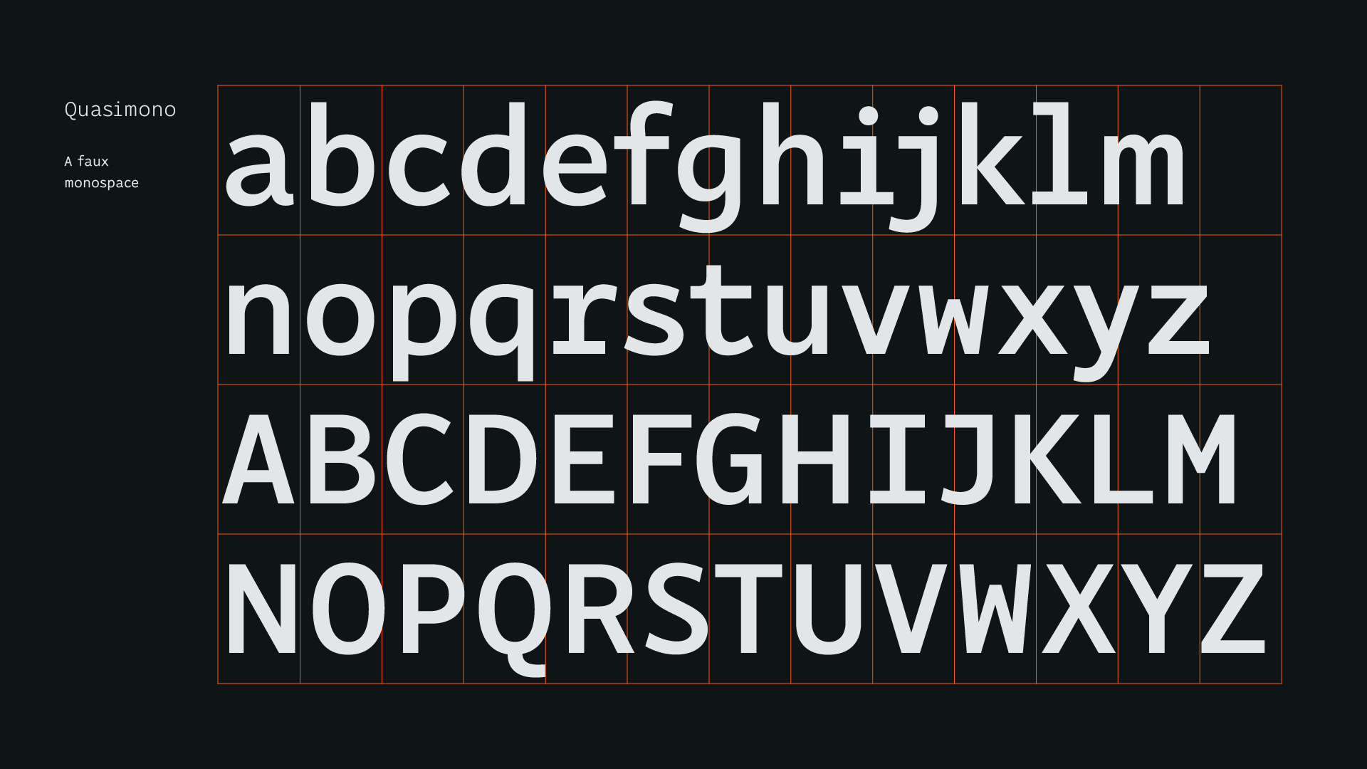
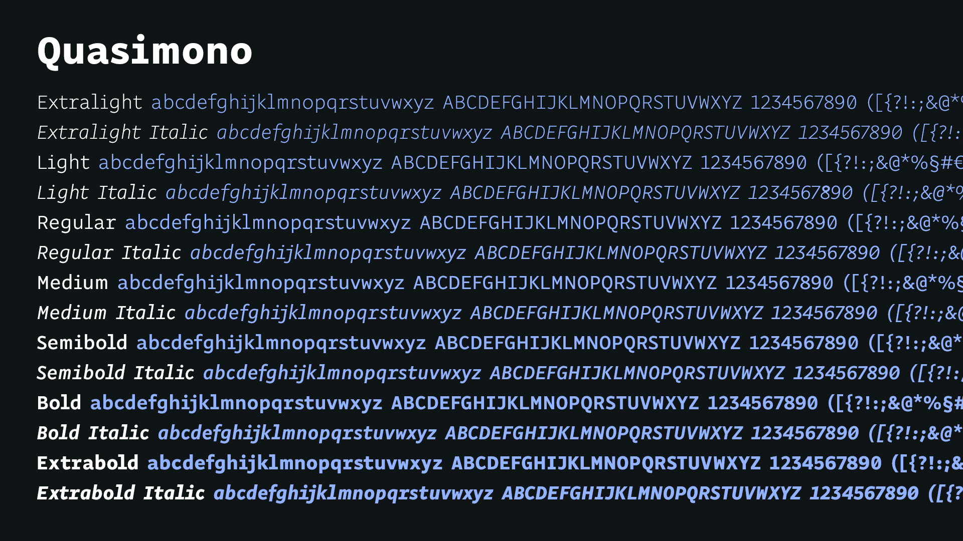
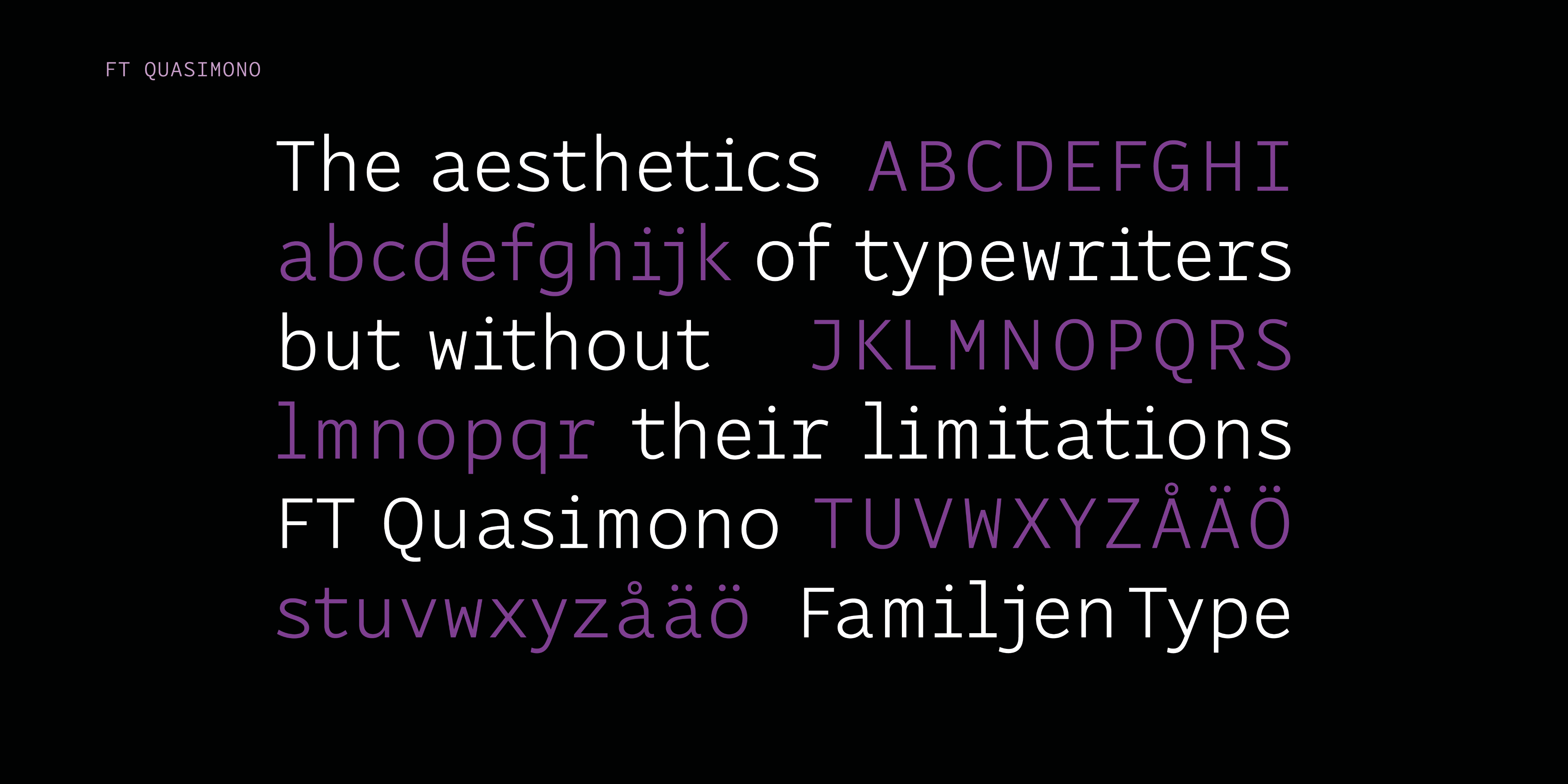
The simple rhythm of typewriter fonts, where every character takes the same amount of space, has often appealed to designers with its no-nonsense appearance. But when you choose a monospaced font for purely aesthetical reasons, there’s no reason that you actually have to make all the characters equally wide. They merely need to look like they are. And there’s no reason you can’t use kerning. Quasimono is a typeface with the aesthetics of typewriters, but without their limitations.
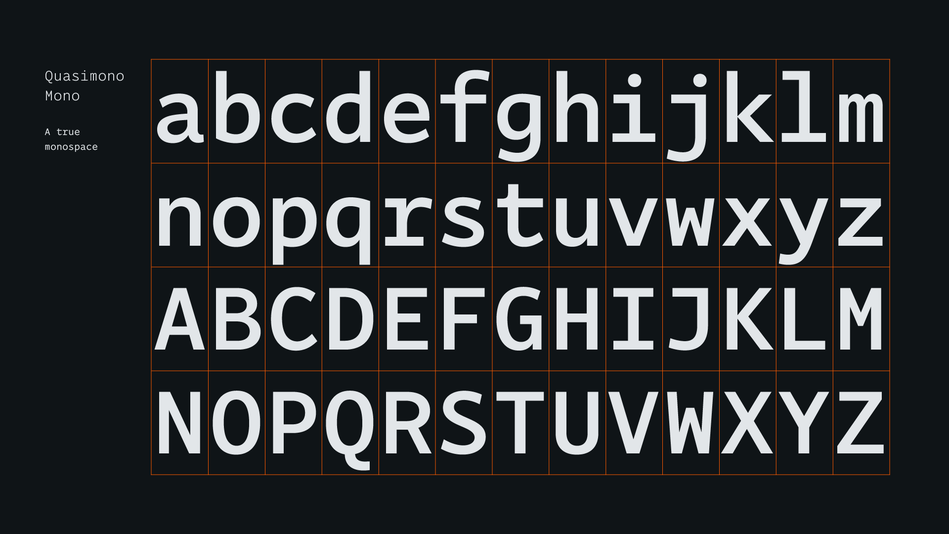
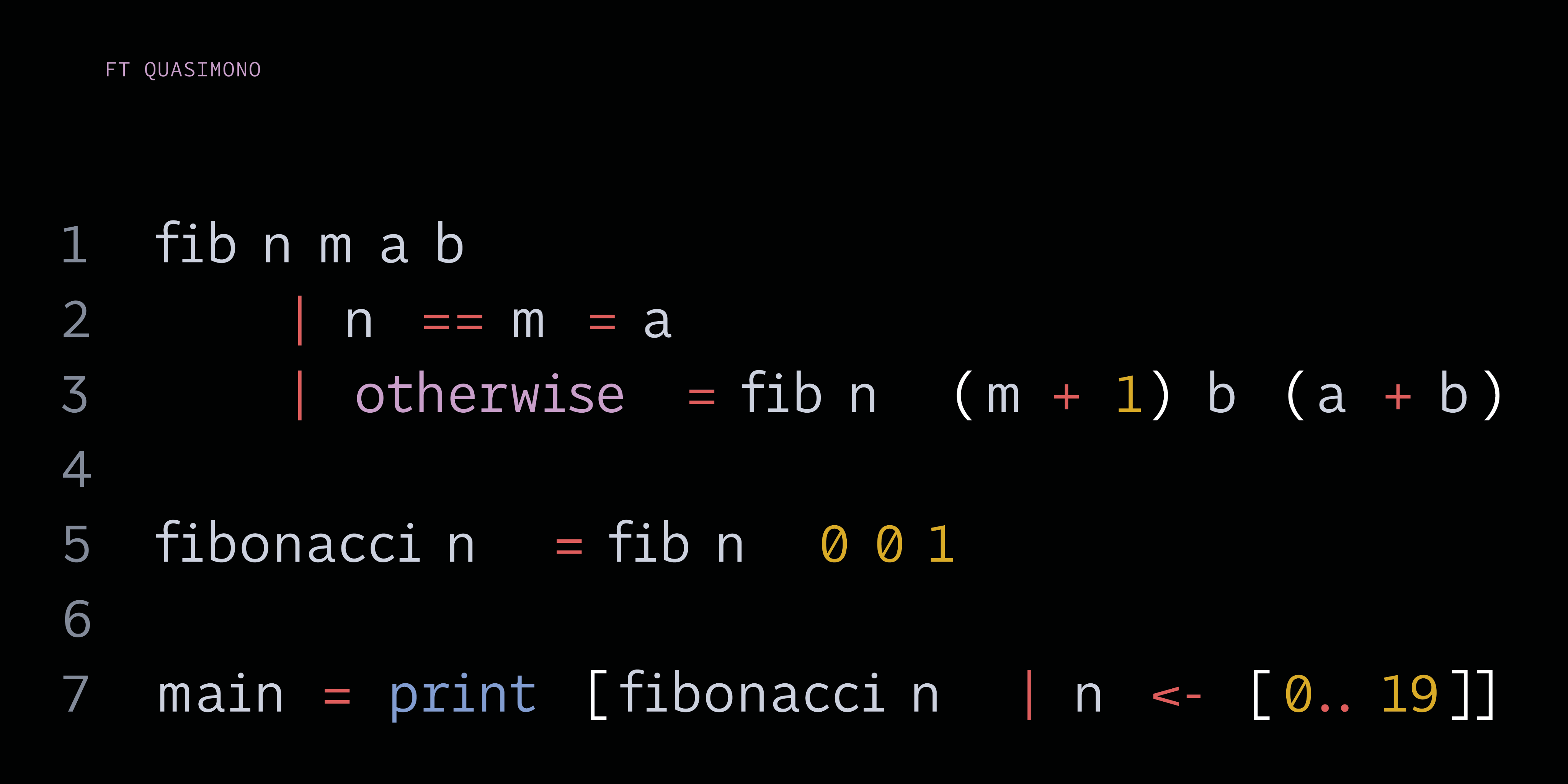
In cases where you need a truly monospaced font, such as programming environments, we have you covered with Quasimono Mono.
You can try and buy Quasimono at I Love Typography.
